Netflix Logo Meaning, Color and Evolution Over the Time
When it comes to relaxation and entertainment, simultaneously the streaming platform that hits the mind is, of course, Netflix. Here, we will discuss the history of the Netflix logo.
If we talk about Netflix’s brand image, many factors are involved in this online streaming brand’s success. This includes customer satisfaction, no ads, and, of course, a grasping and appealing logo that is a blend of electric and visual text. Indeed, the aesthetics of the Netflix logo leave imprints on the viewers’ minds, and its bright red color makes it a phenomenal masterpiece.
This article will discuss the Netflix logo’s history, meaning, and evolution over time. Read the article to learn about your favorite online streaming platform’s logo in detail.
Table of Contents
About Netflix:
Undoubtedly, Netflix is the world’s most famous subscription-based streaming platform. Over 250 million people use it worldwide. During the pandemic, its popularity increased to another level. Over the decade, many web companies arose that changed the internet consumption habits of people, and Netflix is one of such influential platforms.
It was developed in 1997 by two business partners, Reed Hastings and Marc Randolph, in California. At that time, it was a movie rental service. They used to give DVDs for rent. After some time, they started monthly subscription packages for rental DVDs. People would return their DVDs on a specified deadline after watching them.
In 2007, Netflix allowed rental movies on computers. In the following years, they started their primary services, which now offer worldwide online streaming with a subscription.
Moreover, it started with just 30 employees and has grown to 3500 employees. Over the last ten years, they have started their own production house and have had commercial success in their serials. They are also distributing the other media housework.
Undoubtedly, Netflix has become the most-watched online streaming platform in the world.
Does Netflix Have A Free Trial? Understanding, Signup, Streaming Services, Subscription ChargesEvolution of the Netflix Logo:
Now, let’s discuss how the Netflix logo was designed and has changed since the launch of the streaming platform.
1997-2000:
The first logo of Netflix may look dull in the present time, but for the 1990s era, it was a classic piece as it showed a ringlet of film around the word NET and separated it from FLIX. The reel showed the brand content that it was about a movie. The ringlet was in dark shades of blue and purple, whereas its font was styled in San Serif.
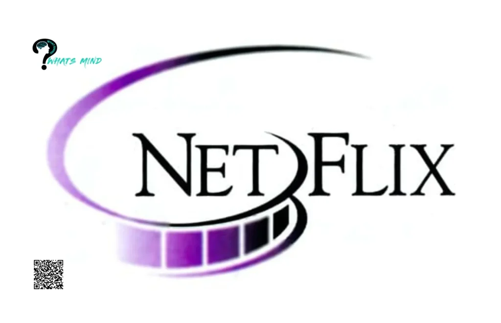
Netflix used this logo for three years straight.
2000-2001:
Netflix used this new logo for just a few months. It was a black horizontal oval solid badge with yellow brackets on the outer side. In the inner, it was a modern square sans serif font written Netflix in lower and upper case letters, and the dot of it was presented as a square box, representing a television box.
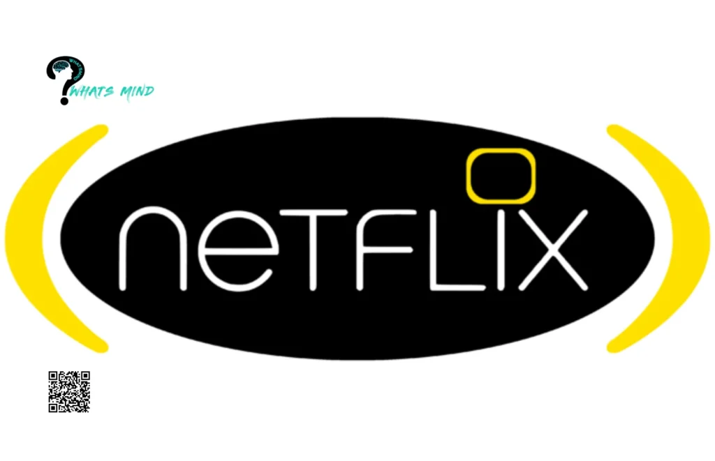
It didn’t take long for this logo to disappear from the website.
2001-2014:
The designer of this logo took the next theme from the vintage cinemascope. Well, the next evolution in the logo lasted for 14 years. It was an aesthetic logo with written NETFLIX letters in white in a San Serif font with a dark red background. Fonts had black shadows on the right side. What a great combination, indeed.
Indeed, this logo stood out from the previous logos.
2014 – Today:
The latest Netflix logo is very well designed. It’s pretty similar to the older one. The red background is dropped now, and it has an extensive, broad white background. Whereas the letters of Netflix are in red, designed by the American logo designer company ‘’Gretel’’. It was redesigned because the owners have rebranded their platform. Now, it is made with a mix of Gotham Bold and Gotham Book fonts.
If you pay attention, then you will notice that its letters are more comprehensive now.
Netflix Icon:
In 2016, the brand developed an icon of Netflix with the letter N. It represents Netflix and is used for mobile apps and social media platforms. And it looks like a ribbon of red color folded on itself with different red colors.
It also appears like a chair in a cinema hall: the dark red reflects the darkness while watching a movie. It is a watermark for mobile apps where a full logo is unnecessary. It was created from scrap, but now it has a tremendous visual influence.
When this aesthetic icon appears on the screen, everybody knows the N is Netflix.
Netflix Logo Font and Color Meaning:
The font used in the latest Netflix logo mixes Gotham Bold and Gotham Book. The upper side of the logo is straight, while the lower side is slightly arched, and the letters are elongated and shortened from the center to the outer sides. It shows stability and professionalism.
The red color in the Netflix logo shows power, energy, and passion. It basically symbolizes how energetically the brand provides services.
Conclusion:
Indeed, a well-designed logo is significant for every brand’s image. The same goes for Netflix, which has an aesthetically appealing logo with a touch of power, passion, and professionalism.
We are sure that next time you watch NETFLIX, you will keep our article in mind about how they designed their logo and what it symbolizes.
For more info visit Whatsmind.com


